Code
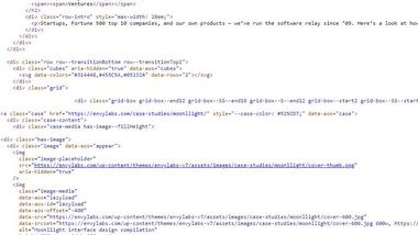
The source code for Envy's site was really clean and easy to read. This was a little surprising as it seems they are using WordPress. I'm guessing they wrote their own theme to keep it this uncluttered. I found it especially interesting to look at how they created the cube effect for the header and footer. The screenshot above shows some of the cube code for the footer. They used svg to create this image. While the source code doesn't show it, the inspect shows the breakdown of how they created each part of this image. I love the interesting visual effects you can create with this.
User Interface - UI
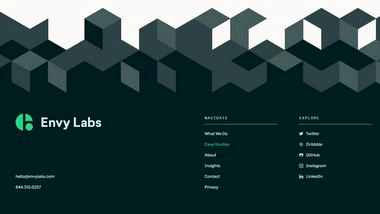
The overall look of the site is visually appealing. I loved the muted, calm green color used throughout the site, and the fact that there was a lot of white space used to give an open feel. The font styles & sizes used were really easy to read. The cube background used both in the header and footer gave a unique texture to the page, making it seem like it was popping out and in the footer, creating a nice transition from the white to dark grey.
User Experience - UX
Envy used a lot of "movement" in their site. Which at times I find to be a little distracting when there's so much of it. For example, the background of the header moving as you move your mouse around is a neat concept, but almost distracted me from the actual words they were trying to show me. The same goes for the rectangle case study blocks below that. Not only did they have a transition of the image growing larger as you scrolled down to them, but there was also a hover transition for each. It was a lot of movement happening at once.
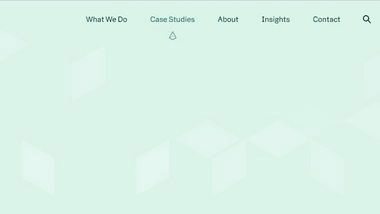
One feature I really liked was the top menu. I loved both the color change and the arrow icon showing you exactly where you were in the site. The icon was appealing and it confirmed your place on the site.
As mentioned above, the colors were calming and easy to look at, which made me want to look around the site more.
Summary
Overall I found the site easy to use and visually appealing to look at. At times the animations/transitions were a bit overkill, and I almost wished there was a bit more information to give better context. But navigating the site was easy, I could quickly find a way to contact them as well as see information about the services they provide.