Code

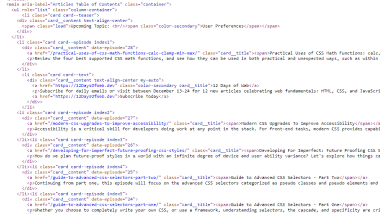
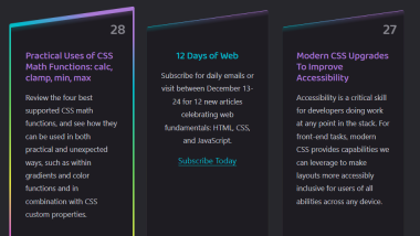
The code for the Modern CSS page was simple, yet creative. I really liked how they used list items to build out the "cards" on the home page. Additionally, I loved their use of the skew property along with the gradient background image to angle and highlight the card. Their code was straightforward and easy to navigate through.
User Interface - UI

Their whole user interface was just like their code - simple, yet effective. I loved their use of the rainbow gradients throughout the site to accent agains the black and grey of the backgrounds. Despite the site being darker in color, the rainbow and bright colors made it bright and fun. The hover affect of the cards was another fun element to brighten up the page.
User Experience - UX

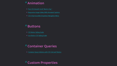
This site is pretty easy to navigate as there are really 2 main options - viewing the list of articles chronologically, or going to a Topics list which lists each article by category. The articles themselves wer really useful and had nice code with examples to learn each topic. The only thing that would enhance this usability of this site more is if she offered a search option somewhere.
Summary
Overall I really like this site. It's a great resource for learning more specific use cases of CSS with great tutorials. It's a simple site that does what it aims to do without overbloating the site with code, yet keeping it visually appealing.