Code

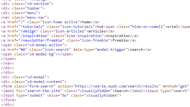
One thing I found really interesting about her coding was the use of a few classes to hide things on smaller screens. In one example, she took her Tutorials menu option and cut out the "orial" from it on screens under 400px, which just left "Tuts". I loved this creative thinking as a way to keep the content applicable without it getting too small, squished, or possibly unreadable on a small screen.
The code itself seemed to be well thought out, adding just what was needed without extra fluff. It was a bit hard to look at in the source code because there was no indenting though.
User Interface - UI

The user interface was very clean and bright. I love how she is able to bring in such a variety of colors without it seeming crazy, messy, or overwhelming. The colors are strong, but muted enough to be easy on the eyes. They flow together and each compliment the other.
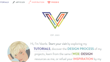
I also loved her use of the SVG art with her logo at the top. That was really fun. I also liked her use of the grayscale filter on her images and how she used it with a transition. It just added an extra touch to it.
User Experience - UX

Veerle's site was really easy to use from an end-user standpoint. I liked her simple menu system that led me to the categories of content. But I love enen more that the main paragraph above the fold gave quick, more specific links to the main things you might come here looking for.
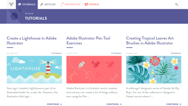
The blog style format of her posts made it easy to browse and read. All of the categories were simply divided and easy to locate with bold headers with colored backgrounds. I also love that she has a prominent search feature on every page.
Summary
Veerle's site is a beautifully designed site. I had a lot of fun browsing around it and seeing what she had. I can't believe I'd never heard of her site before. I'll definitely be coming back to read more of her articles. The site is easy to navigate and nice to look at, plus filled with great content. The trifecta!